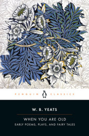
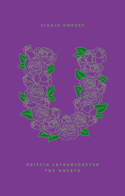
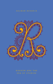
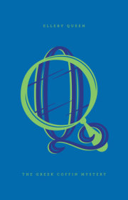
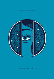
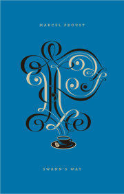
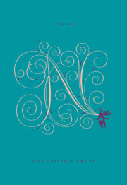
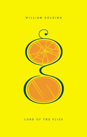
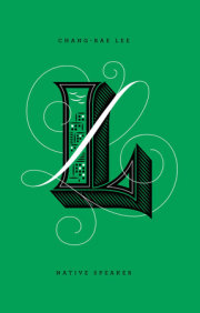
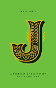
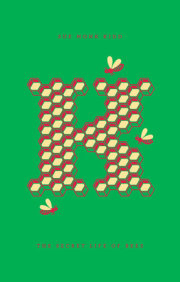
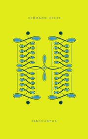
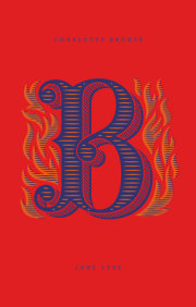
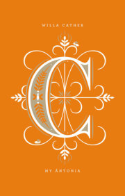
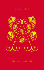
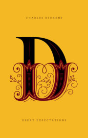
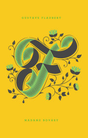
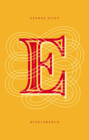
It all begins with a letter. Fall in love with Penguin Drop Caps, a new series of twenty-six collectible and hardcover editions, each with a type cover showcasing a gorgeously illustrated letter of the alphabet. In a design collaboration between Jessica Hische and Penguin Art Director Paul Buckley, the series features unique cover art by Hische, a superstar in the world of type design and illustration, whose work has appeared everywhere from Tiffany & Co. to Wes Anderson's recent film Moonrise Kingdom to Penguin's own bestsellers Committed and Rules of Civility. With exclusive designs that have never before appeared on Hische's hugely popular Daily Drop Cap blog, the Penguin Drop Caps series debuted with an 'A' for Jane Austen's Pride and Prejudice, a 'B' for Charlotte Brönte's Jane Eyre, and a 'C' for Willa Cather's My Ántonia. It continues with more perennial classics, perfect to give as elegant gifts or to showcase on your own shelves.
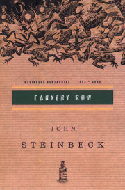
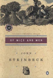
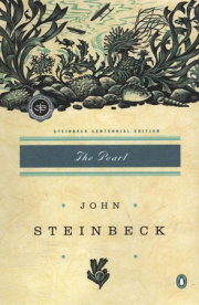
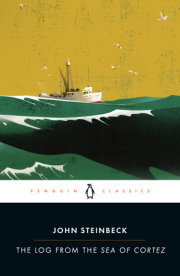
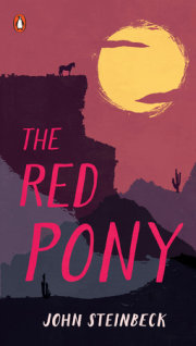
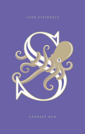
S is for Steinbeck. Unburdened by the material necessities of the more fortunate, the denizens of Cannery Row discover rewards unknown in more traditional society. Henry the painter sorts through junk lots for pieces of wood to incorporate into the boat he is building, while the girls from Dora Flood’s bordello venture out now and then to enjoy a bit of sunshine. Lee Chong stocks his grocery with almost anything a man could want, and Doc, a young marine biologist who ministers to sick puppies and unhappy souls, unexpectedly finds true love. Cannery Row is just a few blocks long, but the story it harbors is suffused with warmth, understanding, and a great fund of human values. First published in 1945, and drawn from Steinbeck's memories of real inhabitants of Monterey, California, Cannery Row focuses on the acceptance of life as it is—both the loneliness of the individual and the exuberance of community.
Winner of the 2012 Fifty Books/Fifty Covers show, organized by Design Observer in association with AIGA and Designers & Books
Winner of the 2014 Type Directors Club Communication Design Award
Praise for Penguin Drop Caps:
"[Penguin Drop Caps] convey a sense of nostalgia for the tactility and aesthetic power of a physical book and for a centuries-old tradition of beautiful lettering." —Fast Company
“Vibrant, minimalist new typographic covers…. Bonus points for the heartening gender balance of the initial selections.” —Maria Popova, Brain Pickings
"The Penguin Drop Caps series is a great example of the power of design. Why buy these particular classics when there are less expensive, even free editions of Great Expectations? Because they’re beautiful objects. Paul Buckley and Jessica Hische’s fresh approach to the literary classics reduces the design down to typography and color. Each cover is foil-stamped with a cleverly illustrated letterform that reveals an element of the story. Jane Austen’s A (Pride and Prejudice) is formed by opulent peacock feathers and Charlotte Bronte’s B (Jane Eyre) is surrounded by flames. The complete set forms a rainbow spectrum prettier than anything else on your bookshelf." —Rex Bonomelli, The New York Times
"Drool-inducing." —Flavorwire
"Classic reads in stunning covers—your book club will be dying." —Redbook
It all begins with a letter. Fall in love with Penguin Drop Caps, a new series of twenty-six collectible and hardcover editions, each with a type cover showcasing a gorgeously illustrated letter of the alphabet. In a design collaboration between Jessica Hische and Penguin Art Director Paul Buckley, the series features unique cover art by Hische, a superstar in the world of type design and illustration, whose work has appeared everywhere from Tiffany & Co. to Wes Anderson's recent film Moonrise Kingdom to Penguin's own bestsellers Committed and Rules of Civility. With exclusive designs that have never before appeared on Hische's hugely popular Daily Drop Cap blog, the Penguin Drop Caps series debuted with an 'A' for Jane Austen's Pride and Prejudice, a 'B' for Charlotte Brönte's Jane Eyre, and a 'C' for Willa Cather's My Ántonia. It continues with more perennial classics, perfect to give as elegant gifts or to showcase on your own shelves.
S is for Steinbeck. Unburdened by the material necessities of the more fortunate, the denizens of Cannery Row discover rewards unknown in more traditional society. Henry the painter sorts through junk lots for pieces of wood to incorporate into the boat he is building, while the girls from Dora Flood’s bordello venture out now and then to enjoy a bit of sunshine. Lee Chong stocks his grocery with almost anything a man could want, and Doc, a young marine biologist who ministers to sick puppies and unhappy souls, unexpectedly finds true love. Cannery Row is just a few blocks long, but the story it harbors is suffused with warmth, understanding, and a great fund of human values. First published in 1945, and drawn from Steinbeck's memories of real inhabitants of Monterey, California, Cannery Row focuses on the acceptance of life as it is—both the loneliness of the individual and the exuberance of community.
Praise
Winner of the 2012 Fifty Books/Fifty Covers show, organized by Design Observer in association with AIGA and Designers & Books
Winner of the 2014 Type Directors Club Communication Design Award
Praise for Penguin Drop Caps:
"[Penguin Drop Caps] convey a sense of nostalgia for the tactility and aesthetic power of a physical book and for a centuries-old tradition of beautiful lettering." —Fast Company
“Vibrant, minimalist new typographic covers…. Bonus points for the heartening gender balance of the initial selections.” —Maria Popova, Brain Pickings
"The Penguin Drop Caps series is a great example of the power of design. Why buy these particular classics when there are less expensive, even free editions of Great Expectations? Because they’re beautiful objects. Paul Buckley and Jessica Hische’s fresh approach to the literary classics reduces the design down to typography and color. Each cover is foil-stamped with a cleverly illustrated letterform that reveals an element of the story. Jane Austen’s A (Pride and Prejudice) is formed by opulent peacock feathers and Charlotte Bronte’s B (Jane Eyre) is surrounded by flames. The complete set forms a rainbow spectrum prettier than anything else on your bookshelf." —Rex Bonomelli, The New York Times
"Drool-inducing." —Flavorwire
"Classic reads in stunning covers—your book club will be dying." —Redbook